
Upon receiving the assignment for a shoe campaign, I opted to leverage a well-known element from popular culture. My immediate thought was STAR WARS, a personal interest of mine. The challenge was to create a poster that convincingly resembled a STAR WARS set. To achieve this, I enlisted a friend to photograph me dressed as a Jedi, with the shoes prominently featured in the foreground. Subsequently, I incorporated STAR WARS-themed elements into the flyer, culminating in a successful and memorable campaign.

While this project does not fall under the category of advertising, I believe it is pertinent to include it due to its alignment with my design aesthetic. I envisioned a vibrant and colorful redesign of U.S. currency, projecting how it might appear two decades into the future. This concept resonated well with my peers and was particularly appreciated by my professor, who chose to display it prominently in Hale Hall.

I am including this piece in my portfolio as it demonstrates my ability to authentically replicate the style of a renowned graphic designer. This work not only pays tribute to his creative genius but also illustrates how his aesthetic can be adapted to resonate with contemporary audiences, even those unfamiliar with his legacy.

When tasked with creating a travel advertisement, I reflected on my visit to Niagara Falls and considered designing an ad aimed at highway travelers, encouraging them to explore Canada. I envisioned a billboard with a 1950s oil painting aesthetic to capture the majestic beauty of Niagara Falls through vibrant and elegant brush strokes, despite much of the work being executed in Photoshop. Although the billboard design was not approved, my mentor recognized its potential and advised me to adapt the design for a Niagara Falls postcard.
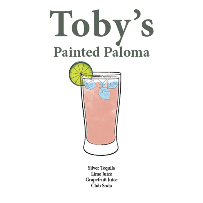
This was a drink menu that I made for my brother's wedding which occurred in mid-October. When I was allowed to make this design for him, he gave me real pictures of the drink to work on and asked if I could illustrate it in the menu as a watercolor design, which would give it a vibrant look. After many redesigns involving the anatomy of the glass and the various brushes used in Photoshop to make it more vibrant with more wet textures. I'm proud to have created this project not just because it was the first thing I did outside of school but for my youngest brother who became the happiest man that day.
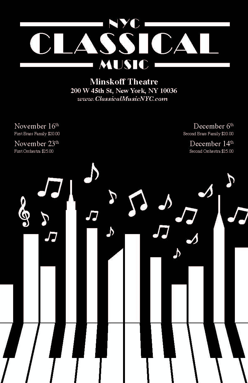
For this project, I was tasked with selecting one of three music genres—classical, jazz, or blues—each being performed at different musical venues. I chose to focus on classical music, specifically an event at the Minskoff Theatre featuring the same orchestra that accompanied the Broadway production of Les Miserables. To effectively engage the audience, I designed a print advertisement in the style of the 1930s, aiming to illustrate the cultural significance of classical music to New Yorkers during the Great Depression.

This was an ad made for the American Museum of Natural History at a time they were sponsoring an event called Unseen Oceans. The idea was to see creatures that are found in the depths of the Pacific Ocean and to marvel at how uncanny and alien-like these aquatic life forms can look, as if they came from another planet. With that idea in mind, I figured “Why not have the reflection of the ocean mimic the stars from the sky and give off the illusion of water to raise the question in the viewer’s mind: “are these fantastic, never-before-seen creatures from the depths of our own oceans or did they descend from space?”.

This project involved creating a two-page spread for D’Addario String, a renowned guitar company. The advertisement aimed to promote their guitar strings, with proceeds supporting a charitable initiative for children learning to play musical instruments. The right side of the spread was dedicated to articulating the company's mission and charitable goals. Utilizing a friend's guitar for the photoshoot, I employed Photoshop to emphasize the guitar and its strings, resulting in a striking and impactful design.

During my typography class at Farmingdale State College, I was tasked with creating a typographic design for trading cards, along with a branded package design. The project required me to target a specific audience, and I chose to appeal to biker communities, death metal enthusiasts, and goths. This decision was driven by the intriguing potential of combining these styles to create compelling artwork. Additionally, I aimed to educate my audience on the anatomy of typography, drawing parallels between typographic elements and skeletal structures.

This was another postcard I made that was meant to advertise the State of Maine. With this project, I had to choose a popular location for travelers. So I went to the Lighthouse of Cape Neddick to give the postcard a traditional marine-like setting.
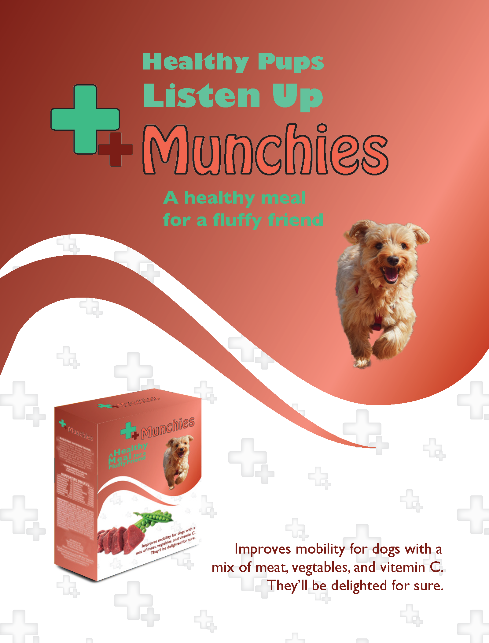
As an avid dog lover, I was thrilled to undertake a freelance project for an organic dog food advertisement. The product, rich in meat, vegetables, and vitamin C, was developed by an animal nutrition company based in Ottawa, Canada. My responsibilities included crafting the company's name, designing a flyer, and creating a prototype for the product packaging. After considering several options, I settled on the name '++Munchies,' which effectively conveys the product's focus on health and nutrition for small dogs and their owners.